Most brands don't have a targeting problem. They have a creative variety problem.
If your idea of "testing creative" is uploading 20 versions of the same polished product video with a different hook line, you're not testing creative — you're testing hooks on one format. Meta's algorithm needs genuinely different ad types to find out who responds to what, and your customers are at wildly different stages of awareness when they see your ads. A cold audience scrolling past your brand for the first time needs something different from a warm visitor who already looked at your product page twice.
The accounts that scale past six figures in monthly spend without cost creep almost never rely on one format. They run five or six fundamentally different ad types at once, let the data sort out the winners, and keep feeding the account new variety before fatigue sets in. Here are the five types worth testing in every account, what each one is actually for, and where each one tends to break.
1. Native static ads
A native static ad is an image built to look like something a friend posted, not something a brand paid to put in front of you. Think a screenshot, a phone photo, a meme format, a "notes app" screenshot — anything that doesn't scream "advertisement" the moment it appears in the feed.
Why they stop the scroll. People have trained themselves to tune out anything that looks like a polished product shot. A native static ad borrows the visual language of organic content, so it gets a half-second longer of attention before the brain classifies it as an ad and moves on. That half-second is often the difference between a scroll-past and a tap.
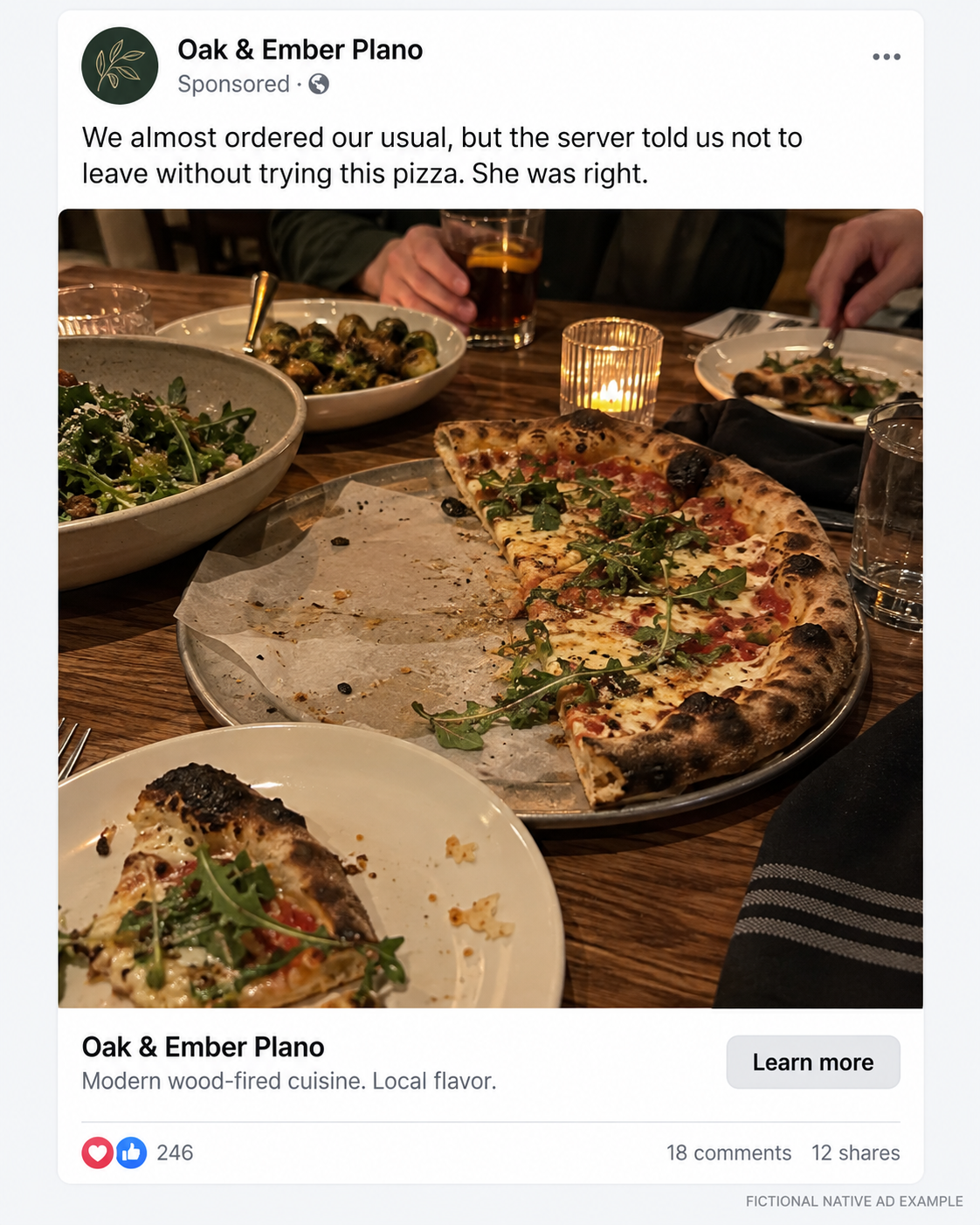
A phone-photo shot of a shared meal, paired with a caption that reads like a tip from a friend — nothing here signals "advertisement" at first glance.
Using the caption to tell the story. Because the image itself looks unbranded, the caption has to carry more weight than usual. This is the format where your primary text does the selling — the image earns the pause, the caption earns the click.
Native image vs. polished product photography. These aren't competing formats, they're sequential ones. Native creative works best higher in the funnel, when someone doesn't know your brand yet and a studio product shot would just read as "another ad." Once they know who you are, polished photography can do more work.

Behind-the-scenes, process-driven content — the caption answers a real question a first-time customer would actually have, instead of pitching the service directly.
Sending traffic directly to the product page. Native ads generate curiosity, not certainty, so sending that traffic straight to a product page without any context can produce a confusing landing experience — the person clicked on what felt like an organic post and landed on a checkout flow. A short-form landing page or an ad that pre-frames the offer in the primary text closes that gap.
When native ads can damage trust. If a native ad disguises itself so well that people feel tricked once they realize it's paid content, that erodes trust fast — especially in categories like health, finance, or anything regulatory-sensitive. Native works because it's honest about being informal, not because it's dishonest about being an ad.

A first-person "I bought this because..." caption paired with an everyday, unstaged setting — this is the native format doing double duty as both attention-earner and mini testimonial.
2. Raw talking-head videos
This is the "shot in a car, kitchen, or home office" format — a person talking directly to camera with minimal production. It's cheap to make and, in a lot of accounts, it's the highest-performing format by cost per result.
Why authenticity can outperform production quality. A polished ad reads as "brand talking at me." A raw talking-head video reads as "person talking to me." That shift changes how the message is received — objections feel like they're being addressed by a peer instead of a sales script.
Founder videos versus customer UGC. A founder video carries authority and story — it works well for explaining why the product exists. Customer UGC carries proof — it works well for showing what the product does for someone like the viewer. Most accounts need both, and they perform differently depending on funnel stage.
The first three seconds. Meta doesn't reward slow builds. If the first three seconds don't either state the problem, tease the outcome, or create a pattern interrupt, the video loses most of its audience before the message even starts.
Adding captions. A large share of Meta's video traffic watches with sound off, especially on mobile. Burned-in captions aren't optional polish anymore — they're the difference between a video that gets watched and one that gets scrolled past silently.
Why "raw" shouldn't mean unplanned. The best-performing "raw" videos are scripted down to the first line, even if the delivery feels off-the-cuff. Raw refers to the production value, not the message discipline. An unscripted ramble with no clear point wastes the format's biggest advantage — it just looks like noise instead of authenticity.
3. Text-heavy static ads
These are ads built around a specific story, situation, or problem — often designed to look like a testimonial, a notes-app screenshot, or a short-form written post rather than a traditional graphic.
Calling out one recognizable customer. The most effective text-heavy ads name a specific type of person or situation instead of speaking to "everyone." "For anyone who's tried three CRMs and still can't find their leads" does more work than "The best CRM for your business."
Writing specific headlines. Vague headlines ("Save time. Save money.") get ignored because they could belong to any brand. Specific headlines ("I stopped losing $400/week to a targeting bug I couldn't see") get read because they sound like they belong to one particular story.
Problem → context → product → result. This is the backbone structure for the format: state the problem in a way the reader recognizes, give it context so it feels real, introduce the product as the turning point, then show the result. Skipping straight from problem to product without context tends to feel like a hard sell.
Notes-app and testimonial-style designs. These formats borrow visual cues from private, unpolished writing — which signals "this wasn't designed to sell you something" even when it clearly was. The visual informality is doing real work here, not just aesthetics.
Avoiding unreadable walls of text. The format lives or dies on scannability. Short paragraphs, line breaks, and one idea per section beat a dense block of text every time — people are reading this on a phone screen while scrolling, not sitting down to read an essay.
4. Animated explainer ads
This format is built for products or services where the customer needs to understand a mechanism before they'll trust the offer — SaaS tools, technical products, or anything with a "how does this actually work" question attached to it.
Visualizing a product mechanism. If your product's value depends on understanding a process — how data flows, how a feature connects to an outcome — animation can show that process in five seconds where text would take five sentences.
Simplifying technical information. The goal isn't to explain everything the product does. It's to simplify one core mechanism enough that a non-technical viewer gets the gist and trusts that the rest works the same way.
Using animation for SaaS and complex products. This is where animated explainers earn their keep — dashboards, integrations, automations, anything that's hard to photograph or film in a way that actually communicates value.
Keeping the explanation focused on the benefit. It's easy to fall into showing every feature because it's all technically accurate. The ads that convert focus the animation on one outcome the viewer cares about, not a full feature tour.
Avoiding generic AI animation. Templated animation with stock icons and generic motion graphics is easy to spot now, and it reads as low-effort in a category where trust in the mechanism is the whole point. If the animation looks interchangeable with a hundred other SaaS ads, it's not doing the explaining job it's supposed to do.
5. Offer-focused static ads
This is the direct-response format — the ad that makes the product, the price, the value, and the call to action unmistakably clear in one glance.
Price anchoring. Showing an original price crossed out next to a lower price, or comparing your price to a category norm, gives the viewer an immediate reference point for whether the offer is good.
Bundles and bonuses. Adding a bundle or bonus can move the perceived value up faster than a straight discount, especially in categories where price-cutting damages brand positioning.
Showing the product prominently. Unlike native or text-heavy formats, this is the one place where the product itself — the box, the interface, the physical item — should be the visual focus. The viewer should know exactly what they're buying without reading a word.
When to use discounts. Discounts work best on audiences that already have some familiarity with the brand — cold audiences tend to respond to the story or the problem first, and only need the discount to tip a decision they were already close to making.
Why an offer ad needs warmer traffic. Putting a hard offer in front of someone who's never heard of you skips the steps where they decide they actually want the product. Offer ads tend to perform best in retargeting or on audiences that have already engaged with softer formats first.
There is no single "winning" format
Strong accounts don't look for the one ad type that wins and then scale it into oblivion. They maintain creative variety on purpose, because each format is doing a different job — earning attention, building understanding, or closing a decision. When one format starts to fatigue, having four others already running means the account doesn't stall while a new winner gets found.
The mistake most brands make isn't picking the wrong format. It's picking one format and calling everything else "testing."
Know which format is actually working
Running five different ad types is only useful if you can actually tell which one is driving results, for which audience, at which stage of the funnel. That's usually where the real work starts — separating a format that's genuinely underperforming from one that just hasn't had enough spend or time to show its number.
ChronoAds pulls that analysis together automatically: it tracks performance by creative and campaign, flags what's actually moving your numbers, and turns raw Meta Ads data into a clear list of what to do next — so you're not guessing which format earned its place in the account.